


FRISKIES CAT FOOD
ART NOUVEAU REBRAND
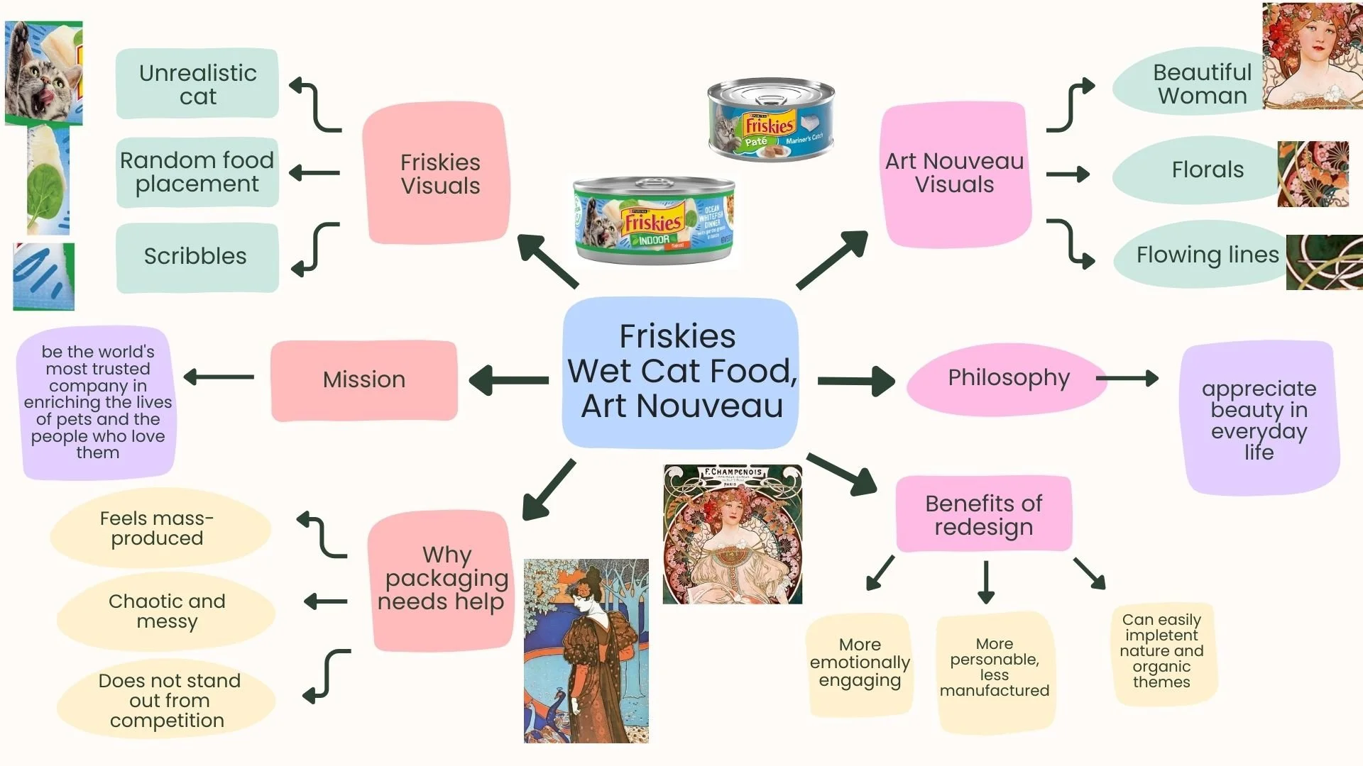
Brainstorm
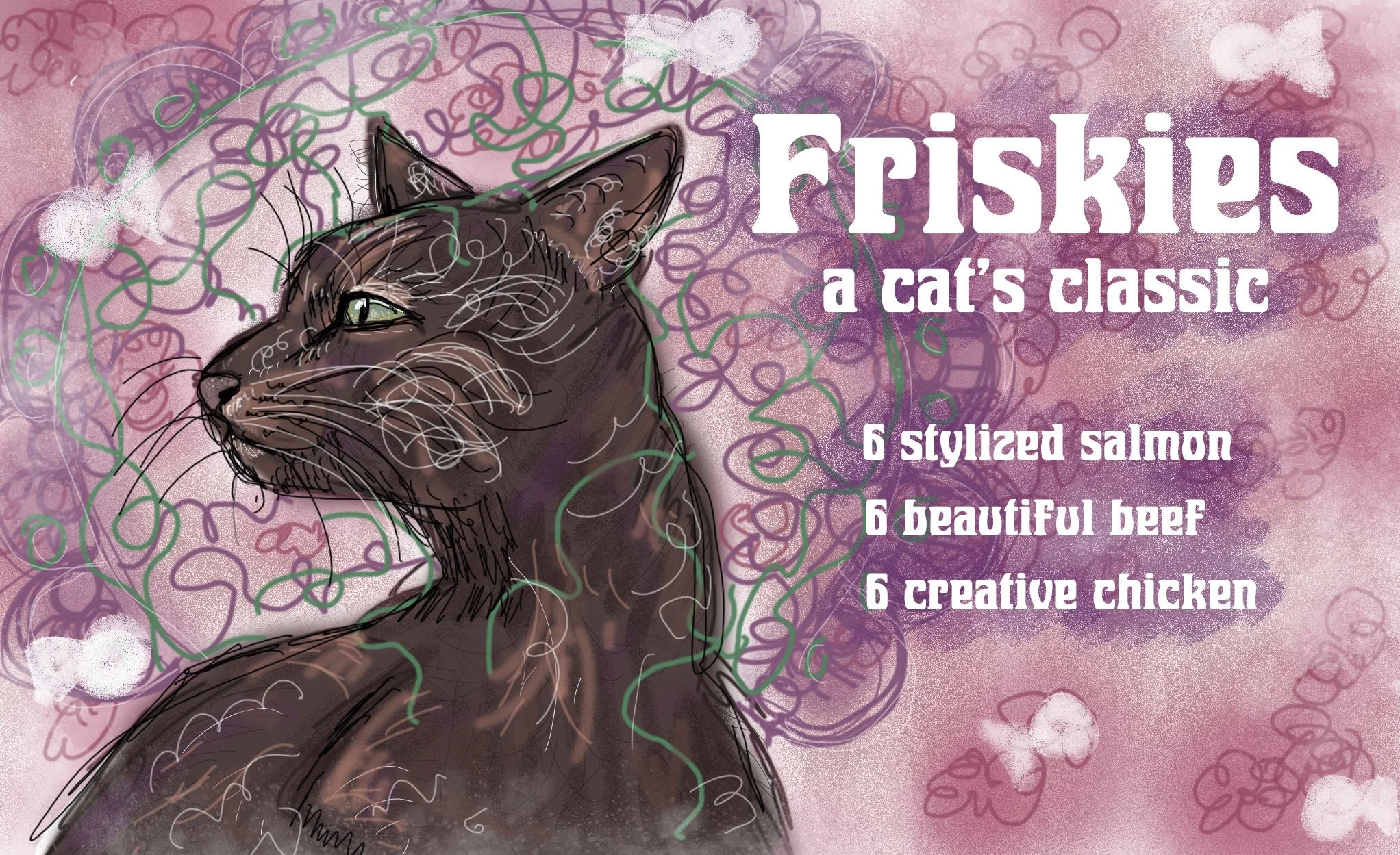
First version— too chaotic!
Overview
This project explores how historical design styles can influence contemporary packaging. I redesigned Friskies wet cat food packaging using visual elements inspired by the Art Nouveau movement. The goal was to create a more cohesive, visually engaging package that stands out on the shelf while maintaining the brand's playful spirit.
Problem
Current Friskies packaging often appears cluttered and overly commercial. The layouts rely heavily on food photography, bright colors, and exaggerated cat imagery, which can feel chaotic and mass-produced. As a result, the packaging lacks a distinct visual identity and does little to differentiate itself from competitors in the pet food aisle.
Research & Inspiration
To guide the redesign, I studied the characteristics of the Art Nouveau movement and the work of artists such as Alphonse Mucha. This style emphasizes organic forms, decorative ornamentation, flowing linework, and nature-inspired motifs. I also analyzed the visual language of current Friskies packaging to identify areas for improving clarity and personality.
Process
My process began with creating a visual mind map to explore connections between Friskies’ existing brand elements and Art Nouveau aesthetics. I then developed sketches focusing on stylized cat portraits and floral framing inspired by traditional poster compositions from the movement. The final illustration was digitally rendered with layered textures, hand-drawn lines, and ornamental details to mimic the expressive qualities of Art Nouveau artwork.
Solution
The final design features a stylized cat portrait placed within a decorative circular frame surrounded by floral and botanical elements. Flowing lines and ornamental shapes create a sense of movement while reinforcing the Art Nouveau aesthetic. Instead of conventional food photography, the design relies on illustration and typography to convey the product flavors in a whimsical, cohesive way.
Outcome
This redesign transforms the product from a visually cluttered package into one that feels crafted, artistic, and distinctive. By incorporating organic forms, decorative illustration, and softer color palettes, the concept positions the brand as more personable and emotionally engaging for pet owners.
